

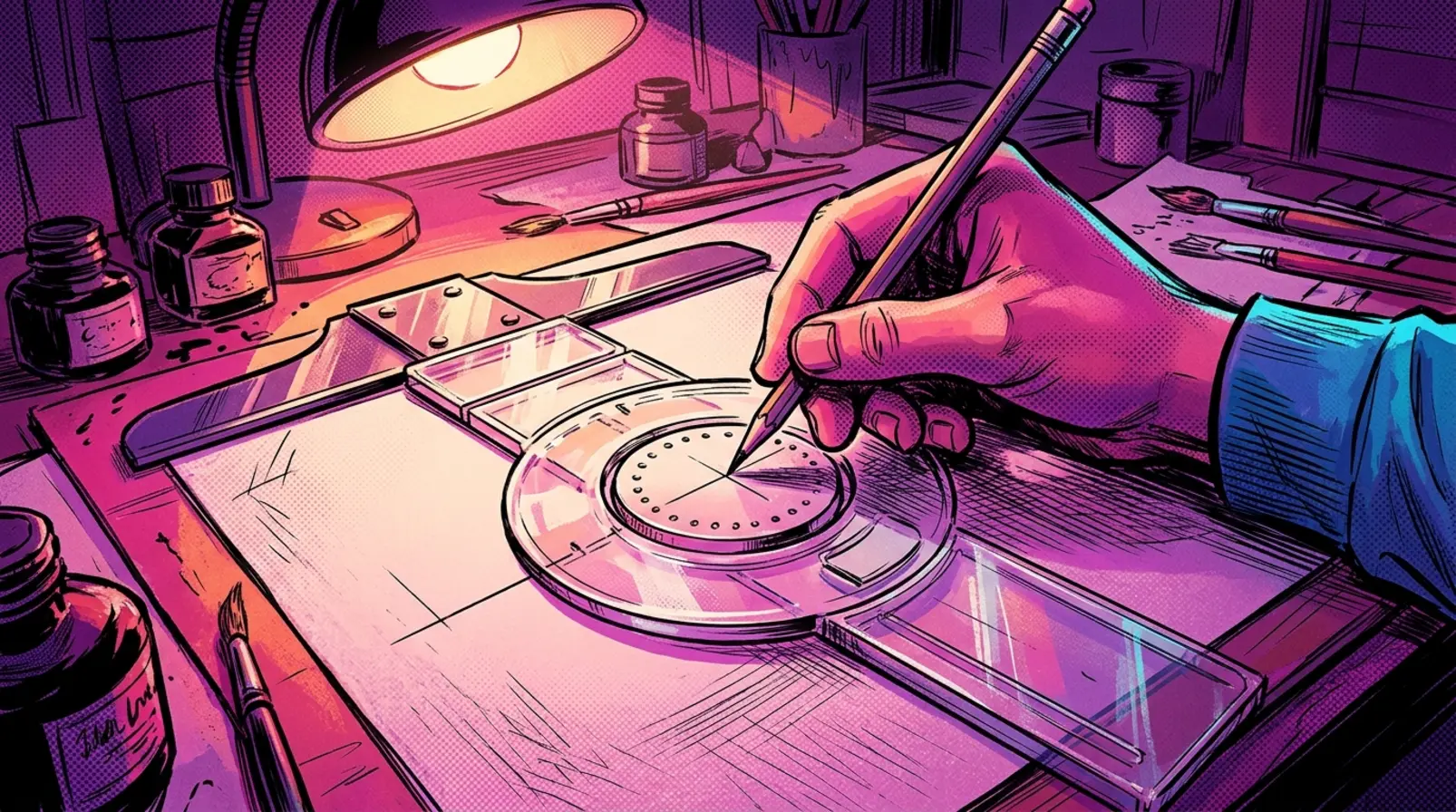


Before a comic book letterer could ink a single word, someone had to decide how tall the letters would be and how far apart the lines should sit. For decades, one of the tools used to make those decisions was a small drafting instrument invented by an engineering instructor in Iowa.
The Ames Lettering Guide looks almost absurdly simple: a clear plastic frame holding a rotating disc punctured with rows of tiny holes. Slide it along a straightedge with a pencil in one of those holes, and it produces evenly spaced guidelines. It doesn’t draw letters, correct handwriting, or make anyone a better artist. It just gives the artist a consistent place to begin.
That modest function made it useful in American comics, where hand-lettered dialogue had to remain legible after the original artwork was reduced for printing. The guide helped letterers maintain consistent proportions while leaving the actual shapes, weight, and character of the lettering to their hands. Decades later, some of those same hands would provide the alphabets used to build digital comics fonts.
From an Iowa Engineering Classroom to the Comics Page
Oscar Anton Olson was born in Norway in 1883 and worked as a mechanical engineering instructor at Iowa State College. His lettering instrument emerged from a problem familiar to technical draftsmen: keeping lettering guidelines uniform across drawings without measuring each line individually.
According to historical research compiled by Alex Jay, Olson described his lettering triangle on March 9, 1917, and filed a patent application later that month. US patent 1,262,971 was granted on April 16, 1918. The central idea was a rotating disc that allowed one instrument to produce multiple guideline spacings.
Olson founded the O. A. Olson Manufacturing Company in 1919. Accounts collected by Jay describe early production in Olson’s basement, where students and students’ wives helped assemble the instruments. A 1922 trade advertisement showed a steel frame with a celluloid disc, an earlier construction than the familiar plastic versions.
Initially sold as the Ames Lettering Instrument, it belonged to the world of drafting tables, mechanical drawings, and engineering classrooms. Its usefulness to comic book artists came from the same practical requirement: lettering needed to be consistent without forcing the person doing it to measure every line from scratch.
The Little Plastic Wheel Behind Comic Book Lettering
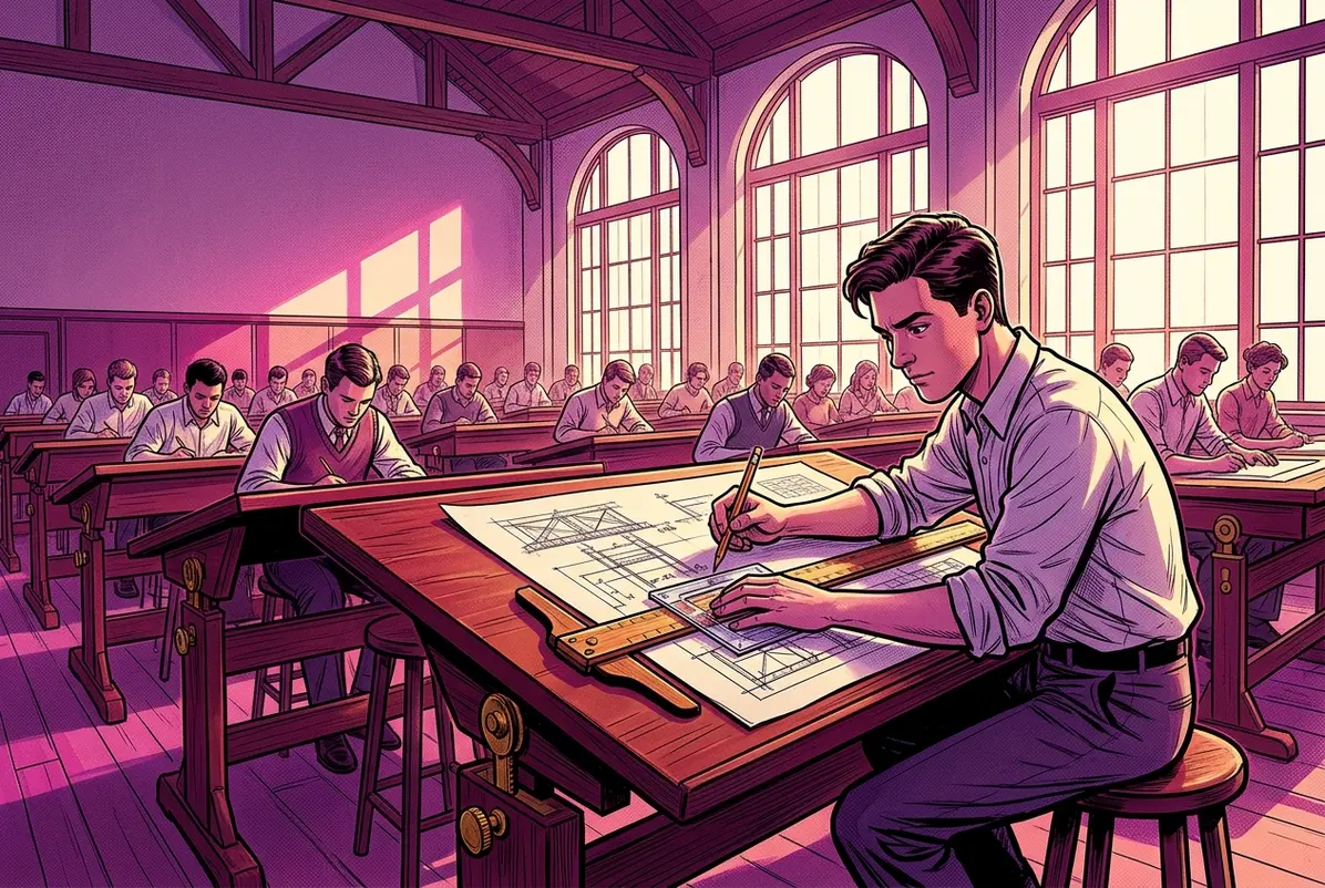
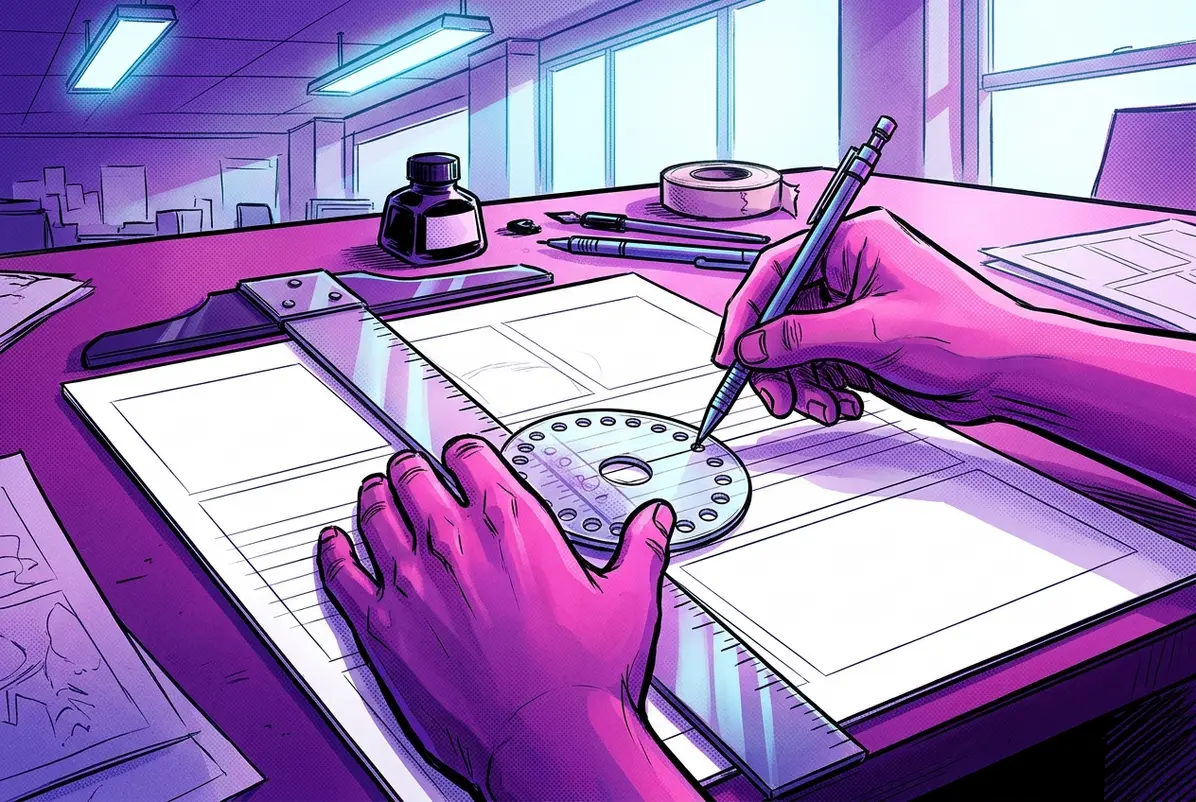
The guide’s operation is straightforward. A letterer places it against a straightedge, inserts a pencil into one of the disc’s holes, and moves the instrument across the page. Repeating the process produces parallel guidelines. Rotating the disc changes the spacing.
The Smithsonian’s National Museum of American History holds an example manufactured by Alvin and Company. Its collection description explains how the rotating disc controls guideline spacing and how the frame can also be used for vertical and inclined lines. The museum classifies the instrument among mathematical drawing tools, a reminder of its technical origins.
For comic book letterers, those guidelines established the space in which the lettering would be drawn. The letters themselves were still made with pens, ink, and practiced movements. A guide could keep successive lines consistent, but it couldn’t reproduce the particular stroke of a Hunt nib or the way a letterer shaped an S.
Rick Parker, who began lettering in Marvel’s bullpen in January 1977, described his working habits to fellow letterer Todd Klein. Parker usually set his Ames guide to 3.25 or 3.5 for comic book pages and to 4 when lettering newspaper strips. He also described preparing his Hunt 107 pen point by clipping and smoothing its tip until it produced the stroke he wanted.
Klein, whose career also began in the 1970s, recalled working at 3.5 or smaller on 11-by-17-inch comic art boards. In his detailed account of traditional lettering tools, he explains that the printed result could be judged by reducing the artwork to its intended publication size, typically around 67 percent.
Those numbers matter because comics lettering wasn’t generally being created at the size readers eventually saw. The lettering had to survive photographic reduction while remaining readable beside the artwork. Newspaper strips, produced and reproduced under different conditions, could call for larger lettering.
The Ames guide gave artists a repeatable measurement, not an identical handwriting style. Parker and Klein could use similar settings while producing recognizably different lettering.
A Tool That Found Other Jobs on the Drawing Board
The Ames guide was also the sort of inexpensive equipment that accumulated secondary uses around a working comics studio.
In comments on a 2010 Comics Beat article about the instrument, letterers described taping the rotating wheel in place after choosing a setting. Others recalled using the plastic to burnish Zip-A-Tone and rub-on lettering, materials associated with comics production before digital workflows became widespread.
Bob Corby, who said he had owned his guide since the 1970s, appreciated its lack of technological demands. There were no software updates, licenses, or subscriptions to worry about. Once purchased, the tool could remain useful for decades.
That durability was part of its appeal. A pen nib might wear down, ink could clog, and correction paint could dry out. The Ames guide required little beyond keeping track of where it had been left on the drawing table.
When Hand Lettering Became a Digital Font
The arrival of digital lettering in comics did not immediately erase the visual conventions of hand lettering. In many cases, the new technology was designed to reproduce them.
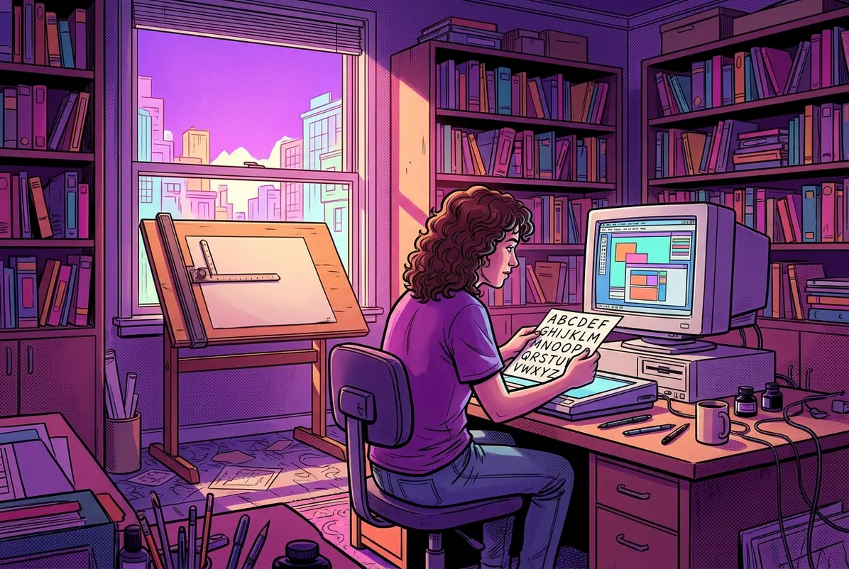
John Byrne was an early experimenter. Todd Klein’s history of digital lettering identifies Namor #8 in 1990 as Byrne’s first credited issue using computer lettering. Byrne later described scanning an alphabet supplied by letterer Jack Morelli and importing the characters into font-making software.
Other letterers followed different routes. Some built their own fonts, others commissioned them, and some initially combined computer-generated lettering with traditional production methods. The shift happened unevenly across publishers and studios.
By 1994, Image Comics and its WildStorm studio were encouraging digital lettering. Marvel followed, with Comicraft becoming a major part of its digital lettering production in 1996. DC made its major transition to an all-digital workflow in 2003, according to Klein’s account of the industry’s conversion.
Klein’s own experience provides a particularly clear connection between the old craft and the new technology. After years of lettering by hand, he commissioned Comicraft to make fonts from samples he had drawn. JG Roshell scanned the characters and developed them using Fontographer. Klein received the finished fonts in January 1995.
The resulting typeface was called Todd Klone. Klein used his fonts to letter Deathblow #20, and over the following decade his workload shifted increasingly toward digital lettering. He also began modifying and creating fonts himself, eventually building a library of more than 100.
The transition was not simply a matter of replacing a pencil with a keyboard. It required computers, scanners, printers, software, and new production skills. Letterers who had spent years mastering pen and ink now had to learn how to construct and manage digital lettering systems.
What Comics Gained and Lost When Lettering Went Digital
Digital lettering offered practical advantages that were difficult for publishers to ignore. Text could be corrected without scraping ink from an art board or applying correction paint. Pages could move through production without the same physical shipping requirements. Lettering could also be replaced more easily for foreign-language editions.
For freelancers paid by the page, speed mattered. Nate Piekos of Blambot has explained the economic pressure behind the shift: faster digital production could improve a letterer’s effective hourly earnings, while reducing the time consumed by corrections and delivery.
But the change also rearranged the work of making comics.
Traditionally, lettering was often placed directly on the original artwork. When publishers moved lettering into separate digital production stages, artists and inkers sometimes had to complete areas that would previously have been covered by balloons. Original pages could also reach collectors without the dialogue that appeared in the printed comic.
Klein records resistance from artists and inkers who disliked those consequences. He also describes letterers struggling to adapt, including established professionals whose careers were affected when publishers changed production methods.
Digital lettering introduced another problem: consistency could become excessive. Hand lettering naturally varies from one instance of a character to the next. A basic font repeats the same shapes, potentially making the text look mechanical.
Some digital letterers responded by creating multiple versions of individual characters. Klein describes Clem Robins developing fonts with several alternatives for punctuation and letterforms, allowing digital lettering to retain some of the irregularity associated with pen work.
Other artists continued drawing letters directly, sometimes using a digital stylus rather than ink on paper. The distinction between hand lettering and digital lettering became less about whether a computer was involved and more about how the letters were actually produced.
The Ames Guide Outlasted the Process It Helped Define
Olson died in 1971, and his family continued producing the guide for decades afterward, according to Klein’s history. Versions of the instrument remain available, and hand lettering continues in independent comics, specialty projects, and work by artists who prefer drawing directly on the page.
The Ames guide’s importance was never that it made everyone’s lettering look alike. It separated one repetitive part of the job, measuring the lines, from the expressive work of drawing the letters.
Digital lettering eventually took over much of that measuring and repetition. Yet some of
Frequently asked questions
Who invented the Ames Lettering Guide?
Oscar Anton Olson, a Norwegian-born mechanical engineering instructor at Iowa State College, invented it. His patent, US 1,262,971, was granted on April 16, 1918, and he founded the O. A. Olson Manufacturing Company in 1919.
How does an Ames Lettering Guide work?
You place the guide against a straightedge, put a pencil in one of the rotating disc's holes, and slide it across the page to draw parallel guidelines. Rotating the disc changes the spacing between lines.
What Ames guide setting did comic book letterers use?
Marvel letterer Rick Parker usually set his guide to 3.25 or 3.5 for comic pages and 4 for newspaper strips. Todd Klein worked at 3.5 or smaller on 11-by-17-inch art boards.
Why was comic lettering drawn larger than the printed size?
Original comic art was photographically reduced for printing, typically to around 67 percent. Lettering had to stay readable after that reduction, so letterers worked at a larger size on the art board.
When did comics switch to digital lettering?
The shift was gradual. John Byrne used computer lettering on Namor #8 in 1990, Image and WildStorm encouraged it by 1994, Marvel adopted Comicraft in 1996, and DC moved to an all-digital workflow in 2003.
Is the Ames Lettering Guide still made?
Yes. Olson's family continued producing the guide for decades after his death in 1971, and versions remain available for artists who still hand letter.


'%3e%3cg id='Final-Copy-2_2_' transform='translate(1275.000000, 200.000000)'%3e%3cpath class='st0' d='M7.4,12.8h6.8l3.1-11.6H7.4C4.2,1.2,1.6,3.8,1.6,7S4.2,12.8,7.4,12.8z'/%3e%3c/g%3e%3c/g%3e%3c/g%3e%3cg id='final---dec.11-2020'%3e%3cg id='_x30_208-our-toggle' transform='translate(-1275.000000, -200.000000)'%3e%3cg id='Final-Copy-2' transform='translate(1275.000000, 200.000000)'%3e%3cpath class='st1' d='M22.6,0H7.4c-3.9,0-7,3.1-7,7s3.1,7,7,7h15.2c3.9,0,7-3.1,7-7S26.4,0,22.6,0z M1.6,7c0-3.2,2.6-5.8,5.8-5.8 h9.9l-3.1,11.6H7.4C4.2,12.8,1.6,10.2,1.6,7z'/%3e%3cpath id='x' class='st2' d='M24.6,4c0.2,0.2,0.2,0.6,0,0.8l0,0L22.5,7l2.2,2.2c0.2,0.2,0.2,0.6,0,0.8c-0.2,0.2-0.6,0.2-0.8,0 l0,0l-2.2-2.2L19.5,10c-0.2,0.2-0.6,0.2-0.8,0c-0.2-0.2-0.2-0.6,0-0.8l0,0L20.8,7l-2.2-2.2c-0.2-0.2-0.2-0.6,0-0.8 c0.2-0.2,0.6-0.2,0.8,0l0,0l2.2,2.2L23.8,4C24,3.8,24.4,3.8,24.6,4z'/%3e%3cpath id='y' class='st3' d='M12.7,4.1c0.2,0.2,0.3,0.6,0.1,0.8l0,0L8.6,9.8C8.5,9.9,8.4,10,8.3,10c-0.2,0.1-0.5,0.1-0.7-0.1l0,0 L5.4,7.7c-0.2-0.2-0.2-0.6,0-0.8c0.2-0.2,0.6-0.2,0.8,0l0,0L8,8.6l3.8-4.5C12,3.9,12.4,3.9,12.7,4.1z'/%3e%3c/g%3e%3c/g%3e%3c/g%3e%3c/g%3e%3c/svg%3e) Your Privacy Choices